Photography by John Kish IV
Scope of Work
Branding
Digital
Print Collateral
Photography
Barrack, Rodos and Bacine—a Philadelphia-based legal practice with offices in New York, Newark, and San Diego—recognized that after ten years, their brand and website needed a refresh. The focus was to create a sophisticated, professional, and visually enticing identity, complemented by a fully-optimized online presence and an updated suite of marketing materials.
Brand Strategy
With 45 years of unparalleled success in litigation, Barrack stands as a beacon of innovation and tenacity in the legal realm. Renowned for securing triumphant outcomes, Barrack's unwavering commitment extends far beyond settlements, ensuring every client receives comprehensive support to navigate the complexities of the legal landscape.
At the forefront of their arsenal is BEAMS, a groundbreaking platform harnessing cutting-edge technology to revolutionize the tracking of class action securities cases. Welcome to a new era of legal advocacy, where innovation meets integrity, and success is not just an option—it's a guarantee.
Final Logo
While the logo primarily focuses on typographic elements, the choice of font and ampersand subtly conveys Barrack's commitment to innovation and tradition.
The modern font represents the firm's forward-thinking approach, while the classic ampersand symbolizes its respect for traditional values and expertise in the legal domain.
Visual Identity
This visual system is the foundation of Barrack's brand identity. Its elements are sophisticated, professional, visually appealing, and representative of Barrack’s core values and objectives.
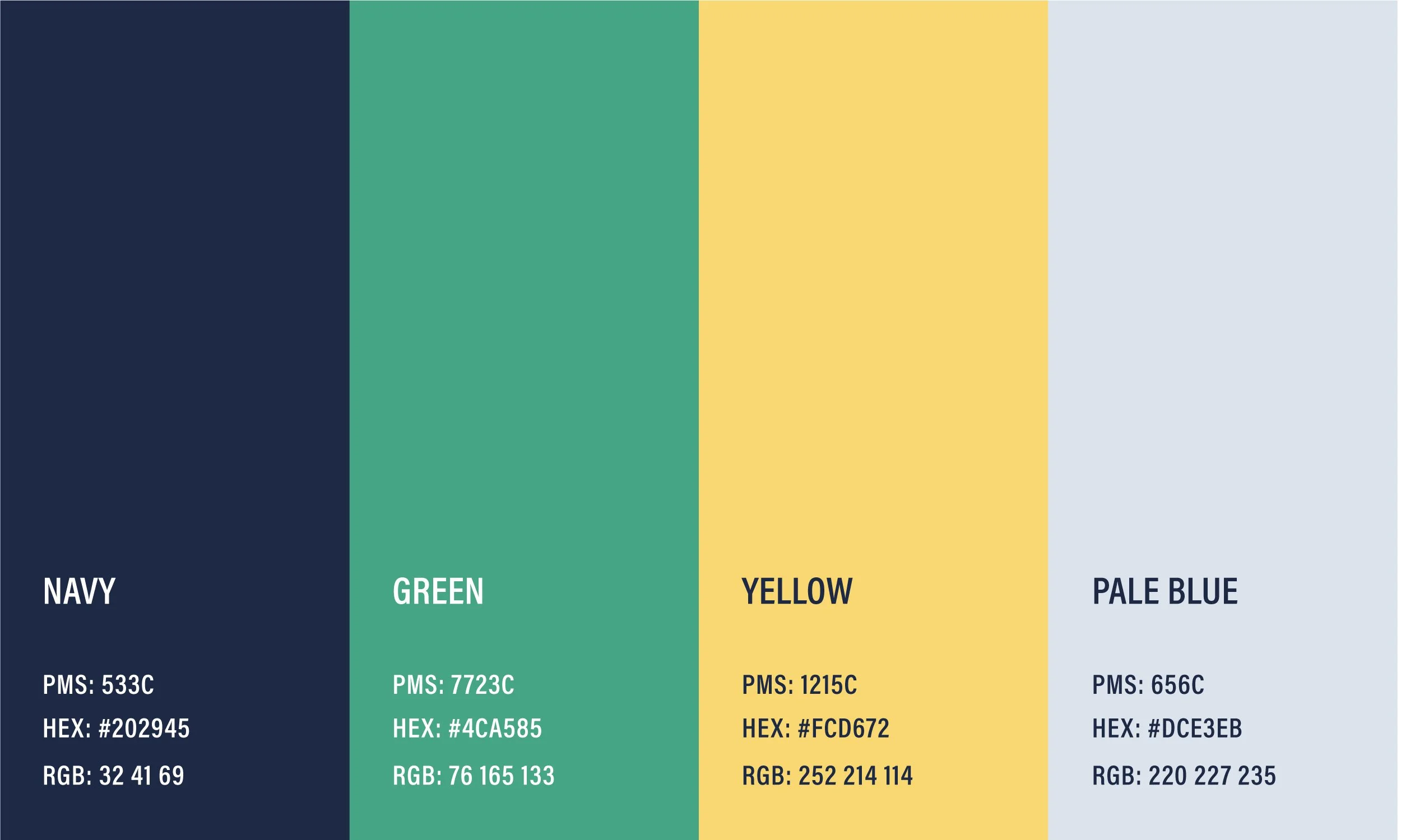
Color Palette
The color palette blends professionalism with modernity and trustworthiness. Navy blue serves as the primary color in the palette. It conveys the firm's reliability and expertise in legal matters. Representing growth, balance, and harmony, green evokes a sense of stability and sustainability.
Yellow brings a modern and refreshing touch to the brand, reflecting the firm's forward-thinking approach. Pale blue reinforces the firm's credibility and integrity in its legal practice.
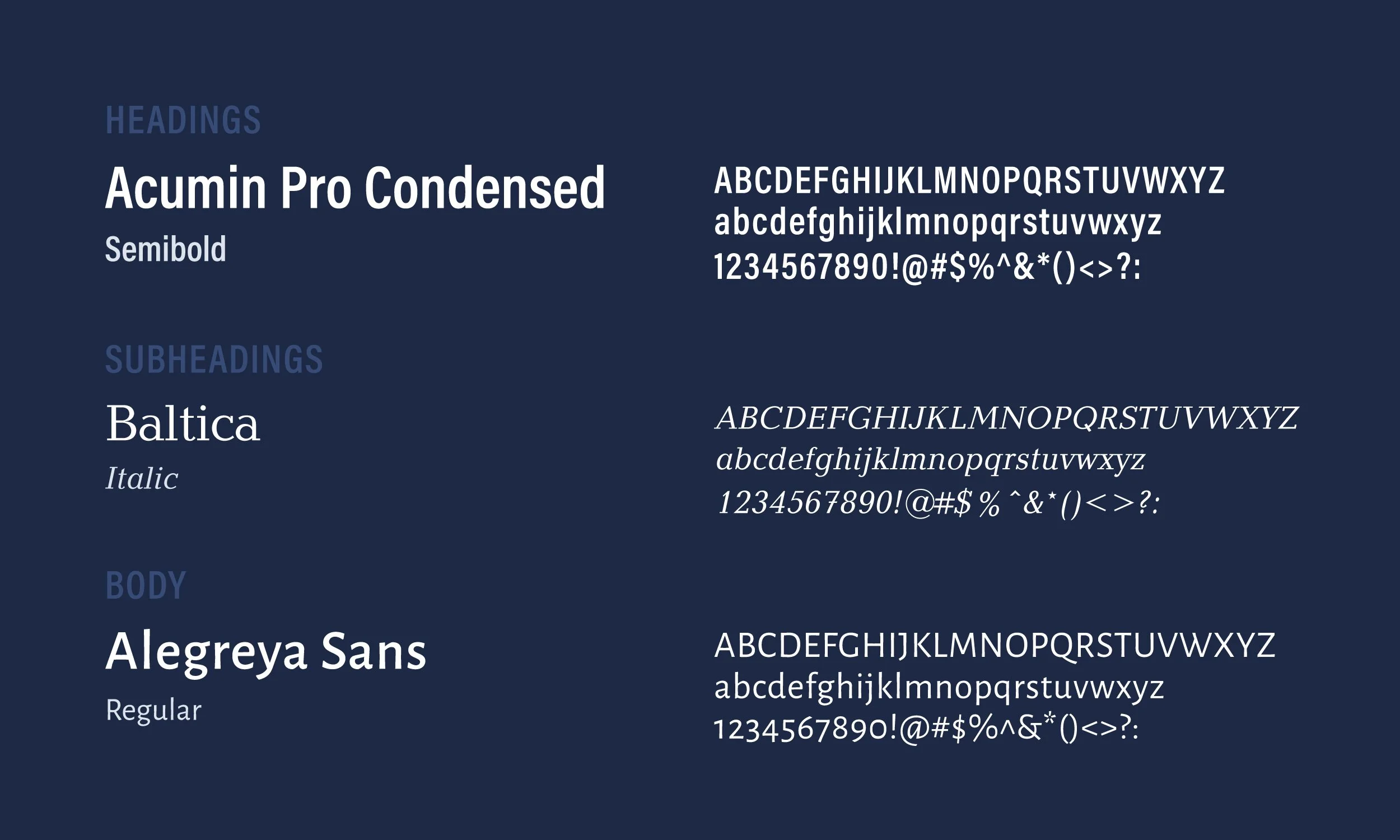
Typography
These typographic families juxtapose “classic” with “contemporary”. Acumin Pro Condensed is used as the primary font, conveying a modern and professional aesthetic. Its condensed form ensures readability while maintaining a sleek and sophisticated appearance.
Complementary to Acumin Pro Condensed, Baltica Italic is employed for subheadings, adding a touch of elegance and distinction. Selected for its clean letterforms, Alegreya Sans ensures optimal legibility for longer passages of body text.
Photography
Photography by John Kish IV
A two-day photoshoot captured “candid” images of the staff at work, as well as updated headshots, aiming to reflect the professional environment and team dynamics.
While stock photography was an option, this approach ensured authenticity and personalization in their visual content.
Website
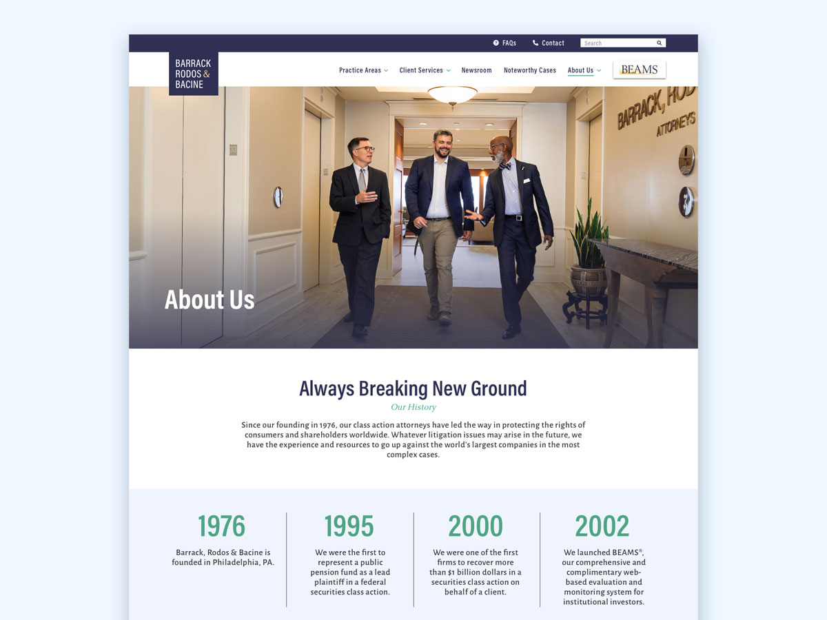
Leveraging the refreshed brand identity, the team at Barrack then wanted a sophisticated, modern, and credible website that showcased the firm’s offerings through visually enticing design and case studies. Part of the objective was also prioritizing mobile optimization for practicality and user experience, as their previous website lacked a friendly mobile experience.
Marketing Collateral
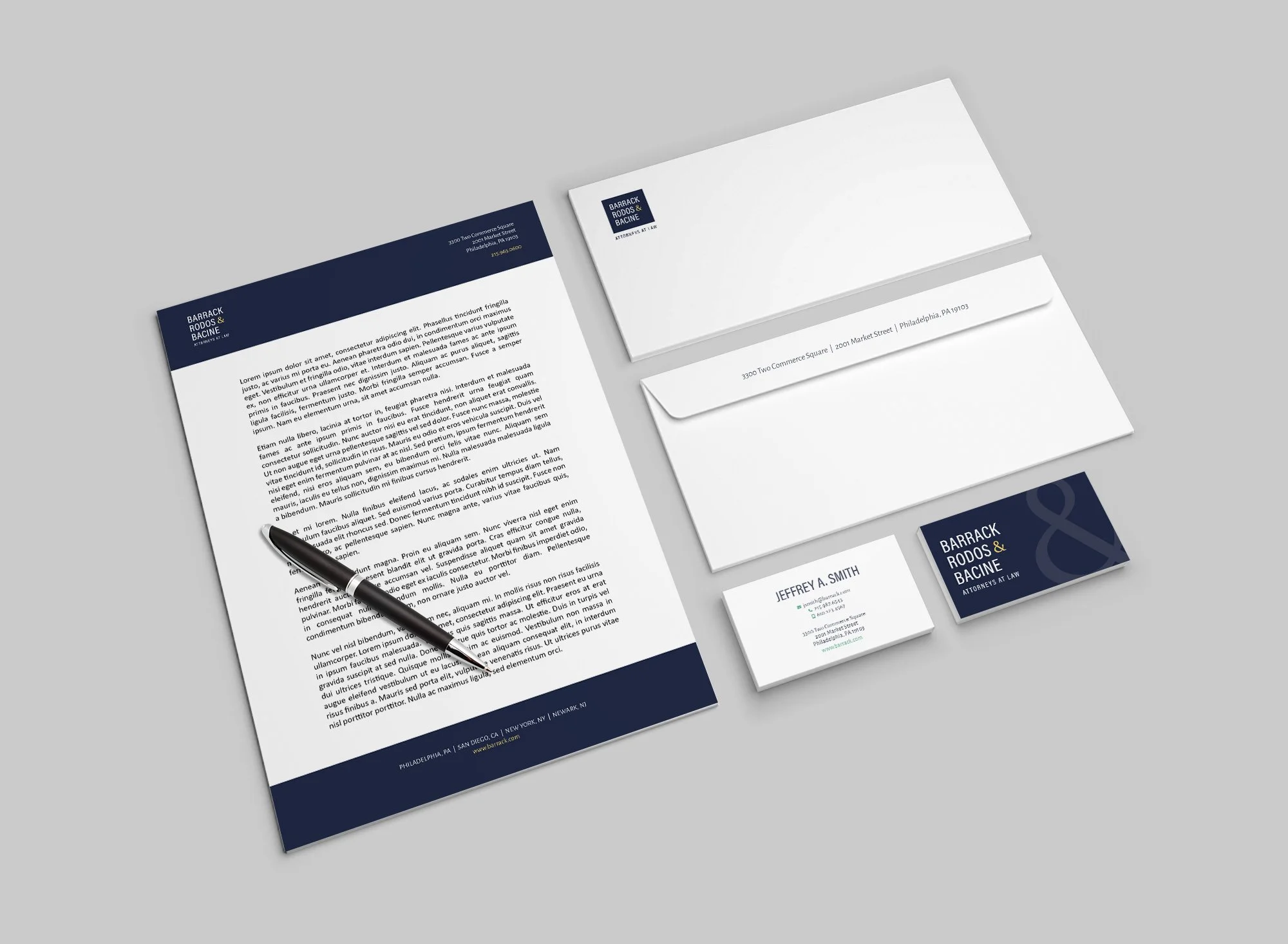
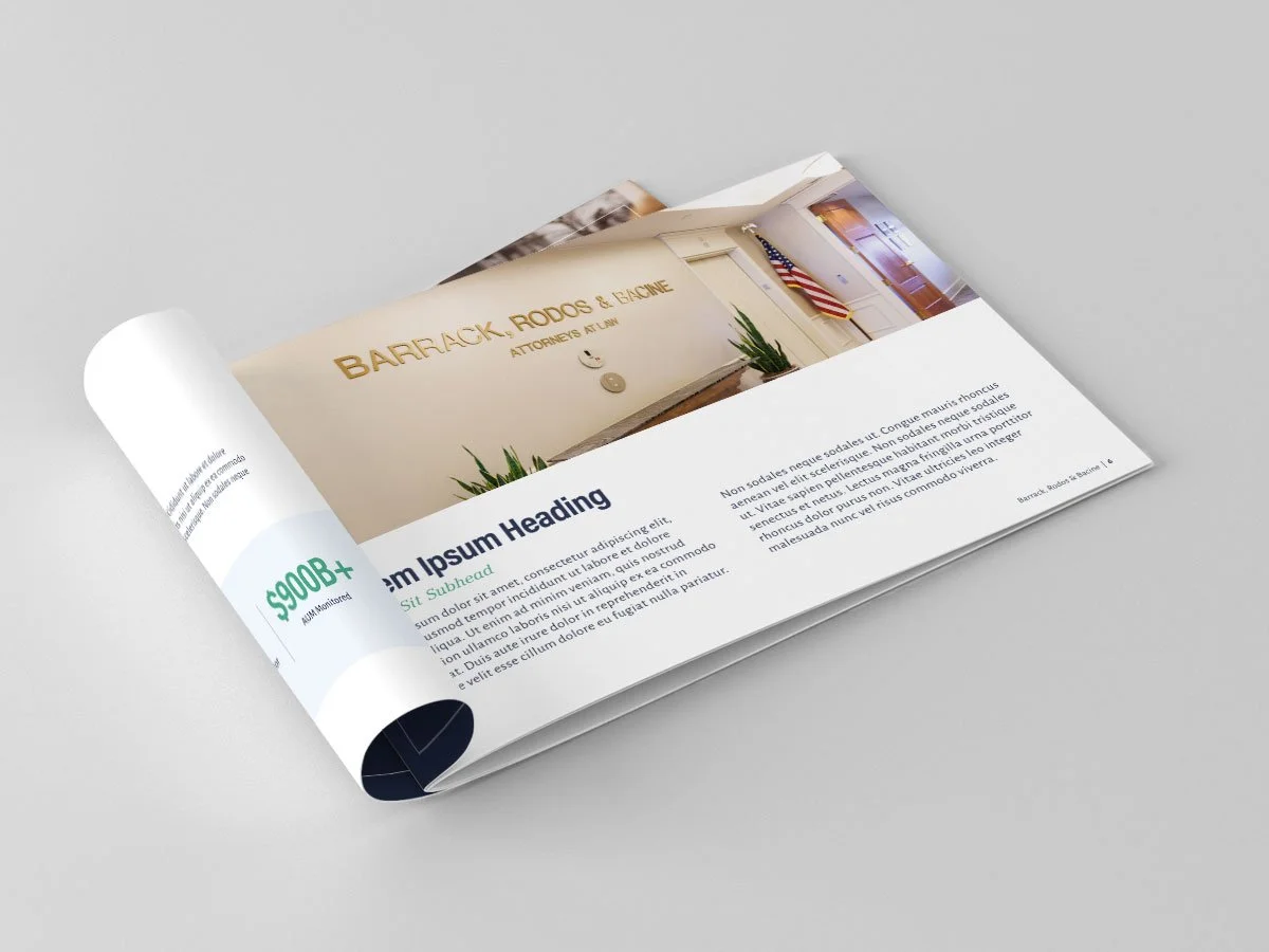
To ensure alignment across the brand, we updated a suite of marketing materials to align with the updated website. Our team provided editable templates for proposals/RFP responses, a letterhead/memo, digital newsletter, and digital brochure. These templates were provided to the Barrack team with placeholder copy so they could tailor and modify the content to meet their marketing needs.


